Little Label, Big Personality: Giving Your Wine Bottle a Makeover
Your wine might be exceptional, but if the label doesn’t speak to potential buyers, it’s sitting quietly in the background. Labels are the silent salespeople of the wine world, working to catch eyes and spark curiosity before the cork even gets pulled.
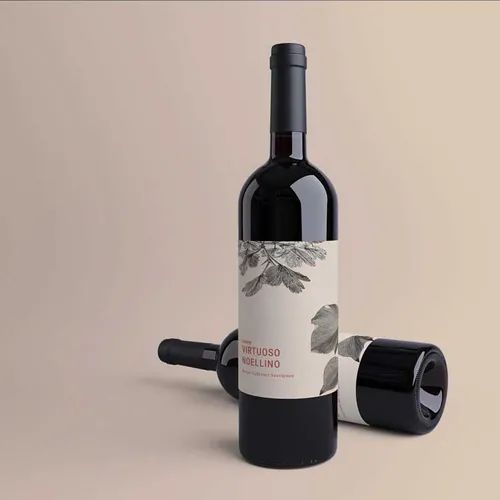
Why Personality Matters: When choosing personalised labels for wine bottles, you’re making a statement about who you are. A bold, colourful design signals fun and approachability. A minimalist label with clean lines suggests sophistication. Your label needs to match the character of what’s inside, creating harmony that feels honest.
Design Choices That Define Your Brand: The world of wine labels offers endless creative possibilities, from traditional vineyard scenes to abstract art and modern patterns. Some winemakers lean into heritage with classic fonts. Others push boundaries with unexpected materials and metallic finishes. The key is authenticity that resonates with people who share your vision.
Building Recognition That Lasts: Your label is the foundation of your brand identity, the visual shorthand that helps people recognise you instantly. When someone picks up your bottle and feels that spark of connection, that’s design doing its job. It’s about creating something memorable that stands out not just today, but every time they walk past a wine shelf.
Creating Connections Beyond the First Sip: Great labels inspire customer loyalty by making people feel something real. They remember the bottle that made them smile, the design that felt like it was made for them. That emotional connection turns a one-time purchase into a relationship, bringing customers back because your wine feels like their wine.
Finding Your Label’s Look
- Playing With Colour Psychology: Colours trigger gut reactions that influence what people buy. Deep burgundies and forest greens feel rich and traditional. Soft pastels communicate freshness and lightness. Bright colours grab attention and suggest energy. Your colour choices should feel right for both your wine and the people you want drinking it.
- Choosing Fonts That Speak: The fonts you pick carry weight beyond the words themselves. Elegant serifs feel timeless and refined. Clean sans-serifs create a modern vibe. Script fonts add handcrafted charm. Just make sure everything stays readable from a distance, because shelf appeal depends on quick recognition and instant understanding.
The Practical Stuff That Matters
Picking Materials That Last: Quality labels handle real-world conditions without falling apart. Consider what your bottles will face:
- Ice buckets and condensation that test water resistance
- Temperature swings during transport and storage
- Rough handling from warehouse to customer’s table
- Extended shelf time in retail environments
Paper labels work great for dry conditions and add premium feel. Synthetic materials resist water and rough handling better. Choose based on where your wine lives and how it gets treated.
Finishes That Catch the Eye: Surface treatments turn simple designs into something special. Matte finishes look sophisticated and photograph beautifully. Gloss coatings make colours pop under store lights. Textured papers invite touching. Foil accents create luxury without breaking the bank. These details separate ordinary from unforgettable.
Getting the Details Right
- Meeting the Rules: Wine labels need specific information like alcohol content, volume, and allergen warnings. The trick is fitting these requirements in without killing your design’s impact. Smart placement and thoughtful typography keep compliance present but not overwhelming.
- Staying Budget-Smart: Creating distinctive labels doesn’t need huge money. Digital printing makes short runs affordable for small producers. You can start with a strong design and vary details like vintage years without complete redesigns. This keeps your look consistent across different products.
Final Words
Labels give your wine the personality it deserves, turning bottles into ambassadors that work for you non-stop. The right design communicates your values, attracts your people, and builds recognition that keeps them coming back. Great wine needs great presentation to shine.
Ready to give your bottles the glow-up they’ve been waiting for? Chat to our team about creating labels that capture your wine’s character and make it impossible to ignore.
Featured Image Source: https://degqkf7c4iqz7.cloudfront.net/labexonpr/images/opt/products_gallery_images/Premium-Wine-Labels-Merlot-Bottle.jpg.webp?v=7055